Charter can draw four kinds of charts: line, column, pie, and scatter charts. It can also draw stacked column charts as well as combination column and line charts.
Labels and legends can be added to charts.
Persons not used to Excel may find this apt useful. It doesn't have as many options but simple graphs are easy. For simple problems, all that is needed is to pick the type of graph, enter values separated by commas into one or more data boxes. and then click the "Draw the chart" button. (For scatter charts, two data boxes (an even numbered one for x values and the next odd numbered one for the corresponding y values.) If desired, labels for data points can be added for all but scatter charts. See the legends section on how to add legends for charts with multiple data lines.
After any changes in the data or other information, one must click the "Draw the chart" button in order to see the result.
Charter uses a significantly modified version of Grapher.
It is best to make sure that "Allow motion" is not checked before typing anything to change any of the input boxes.

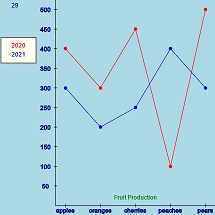
A line chart draws lines between the specified data value values. One can use multiple data boxes. The example, "Fruit Production - line chart", uses two data boxes for curves, and a data box for "w" word label to provide a title for the chart. Labels have been supplied for each data value. Each data box begins with "@" and the legend title for the data.
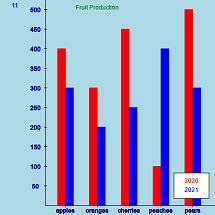
A column chart draws vertical bars to represent the data. One can use multiple data boxes. The example, "Fruit Production - column chart", is very similar to the related line chart. It uses two data boxes for columns and a data box for "w" word label to provide title for the chart. Labels have been supplied for each data value. Each data box begins with "@" and the legend title for the data. Legend has been moved to a convenient spot.
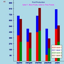
A stacked column chart stacks columns instead of putting them side by
side. To create a stacked column chart, select "Column" and then enter
data as normal except prefix any columns that should be stacked with
stack, or just st,.
As shown in the example, "Fruit production - Stacked column chart", it is
possible to have multiple stacked columns. After the first stacked column
is complete, start a new data set and then stack the next data set.
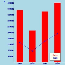
A combination chart contains both columns and lines. To create a combination chart, one begins by selecting "Column" chart. Then data for the columns is provided in the usual manner. After all the columns are added, one prefixes the data for one or more lines with "_,". Do not include the quotes. (Hopefully, the underline character will remind you of "line".) The example "Sales and Profit - combination column and line chart" illustrates one possibility. Data 0 was used for the columns, Data 1 was used for the line. Labels were supplied and a legend was also used.
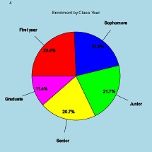
A pie chart is often used to show how each piece is in portion to the whole. In the example "Enrollment by Class Year - pie chart" some options have been used. Labels have been supplied for each section. The values and percent options have been selected.
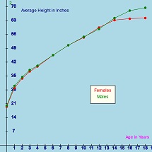
A scatter chart is similar to line chart except the x values are not necessarily equally spaced. The user supplies both x and y values. The x values are given in even number data boxes (0, 2, and/or 4) and y values in the next odd boxes (1, 3, and/or 5). In the example, "Average Height for Kids - scatter chart" Data 0 and Data 1 are used for female data while Data 2 and Data 3 are used for male data. Why was a scatter chart used instead a line chart? Data was available for every year 0, 1, 2, 3, and 4 but only for even years 6, 8, ... 18. If a line chart had been used the shape would have distorted if data for 1 and 3 years had been included. On the other hand, if 1 had not been included, the chart would have misrepresented the value for 1. Legends have been used and the legend box was dragged to the current location.The connect option has been checked. "w" word labels were used to label the axes.
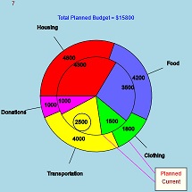
To keep the previous examples fairly simple, only a few enhancements were used: labels, legends, and "w words (for titles and labels). In the following sections we will detail them and add a few more enhancements. Many are illustrated in the enhanced pie chart on the right and in the enhanced Column chart below.
Labels can be used in any chart except scatter charts. For line and column charts, labels are shown below the x axis. In pie charts, labels are shown adjacent to pie slice with a line pointing to the slice. Enter labels in the Labels box, separated by commas. If there are fewer labels than data items, numbers are used as needed. Labels are suppressed if the Label check box is unchecked.
Legends can be helpful when a chart contains multiple data sets.
To supply a legend, just prefix the data with
@desired legend,
In the case of scatter charts, the
legend must be placed with the x data in Data0, Data2, and/or Data 4.
In general, legends should be fairly short although some what longer
legends can be used in the enlarged canvas.
The legend rectangle can be dragged to a convenient location.
"w" lines are commonly used to add titles to charts. In scatter charts, they can be useful for labeling the axes. (See the scatter chart section for an example.)
The format for a w line is
w x location, y location,
the word
Multiple words can be put on the same line by just adding the x, y, and
word values. The x and y values are relative to the chart. For line and
column charts, the first data item is at 0 and data items are numbered
consecutively. The values on the y axis are as indicated on the chart.
For pie charts both the x and y axis have hidden values
from 0 to 10. The center of the pie is at (5,5). It is normally best to add
the "word" after viewing the data shown in the chart in order to
determine an appropriate location.
It possible to add circles (or ovals) charts as done in the "Enhanced pie chart" to emphasize important points. Circles will look like circles in pie charts (because the x and y axes are scaled the same) but normally look like ovals in other kinds of charts because the x and y axes normally are scaled differently.
The syntax is
r= radius, center x, center y
(Actually the x and y values are optional. Default center is (0, 0)
which is rarely appropriate in charts.) The circle in the enhanced pie
chart is specified by the formula
r= .5, 4.6, 3.4
which means the radius is .5, and the center is at (4.6, 3.4).
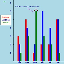
This option allows adding 1 or more line segments to a chart. They were used in the enhanced pie chart to help associate the items in the legend rectangle to the two pies. One line was used in the enhanced column chart to help point to the record sales of phones in the "Weekly Sales - Enhanced column chart".
The format is
L x1, y1, x2,
y2
where (x1, y1) and
(x2, y2) are end points of the
line segment. Either "l" or "L" can be used but "L" might be preferred
to avoid confusion with the number 1. One can specify multiple lines
segments by just repeating the 4 values. For example, in the enhanced
pie chart,
L 8.35,0.6, 6.9,2.4, 8.35,0.1, 5.4,2.75
is used to draw two lines: one from (8.35, 0.6) to (6.9, 2.4) and the second
from (8.35, 0.1) to (5.4, 2.75).
Some possible uses include drawing trend lines or horizontal lines at certain y values to make it easier to estimate values of the data.
This option adds a points or points to a chart. The syntax is
p x, y
Multiple points can be obtained by adding x and y values.
Points were used in the "Weekly Sales - Enhanced column chart"
to help emphasize the record sales. They were created with
p 1.95,6.1, 2.15,6.25, 2.35,6.1
which draw points at (1.95, 6.1), (2.15, 6.25) and (2.35, 6.1).
The points will be connected by straight lines if "Connect" checked. Unfortunately, the y value is displayed above the point if Value is checked which diminishes their usefulness.
The values in a, b, ..., e boxes below the canvas can be used in data sets. As an example as to why this may be useful, consider the "Budget - Enhanced pie chart:" example. While the "Current" values are set, the planned values are not and subject to experimentation. Changing values in a data set box might be error prone, so the values of Housing, Food, and Clothing are stored in value boxes a, b, and c. Changing the value in the boxes and clicking "Draw the chart" will redraw the chart.
The d value box contains a formula for the sum of the planned data values. It is displayed in the "w" title heading near the top of the chart.
The value for Transportation is fixed at 4000. But the value for Donations is specified by e. Before explaining e, we need to look at value s.
The value for s is determined by a slider which allows values from
0 to 100. Because these values are often not immediately useful, it
is common to adjust the value of s with a formula in one of the value
boxes. In this case, value e is set to 20 * s which means that
the value of e can change from 0 to 2000. Then the value for
Donations is determined by e. If one changes the position of
the slider and then clicks "Draw the chart", the chart will be redrawn.
Data 0 contains the statement:
@Planned, a, b, c, 4000, e
The statement for Data 1, which determines the heading is:
w 5,9.3,Total Planned Budget = $^d
"^d" means to substitute the value in value d into the "word".
Most of the time, Charter determines appropriate values for the limits for the x and y axes. However, sometimes, users might want to set one or more limits. Depending on the current chart mode this may be possible. For line and column charts, one can set the maximum x, minimum y, and maximum y but not the minimum x. For scatter charts, all four limits can be set but the limits for the pie fixed and can't be changed.
You can use formulas including the a, b, ..., e and s values in any of input boxes.
The operational signs are +, -, *, /, % and **. You can use ( and ) to control the order of operations and with functions.
The % operator means modulus. That is, if we have a % b we would divide a by b as integers and the result is the remainder. For example, 13 % 3 = 1 as 13 divided by 3 is 4 with a remainder of 1. Some more examples: 11 % 5 = 1. 215 % 10 = 5.
The ** operator means "to the power". Thus, 3**2 = 9, 2**3 = 8, and 10**3 = 1000.
You can use some constants: PI (π = 3.141592653589793), QUARTER_PI, HALF_PI, TWO_PI, Math.E (e = 2.718281828459045).
You can use some values: a, b, c, d, e, and s.
Some of the functions that can be used are:
Order of evaluation:
Illegal values like sqrt(-2) and 1/0 are ignored.
After you finish typing a function, press "Enter".
Formulas can contain comments using // and /*...*/.
Sometimes it is useful to zoom in to see part of the graph more closely. The "Zoom in" button does this. The domain is reduced by one half and the graph is redrawn. If both the y minimum and x maximum are specified the range is reduced in a similar manner. Otherwise the range is determined in the usual manner. Unfortunately, the domain may still not be as desired. In that case, the user can set the center of the graph by double clicking at the desired point.
"Zoom out" increases the domain by a factor of 2.
When Equal Spacing is checked, the units on the x and y axis are the same so a 45o line would look like a 45o line and circles will look like circles.
For the sake of efficiency, Charter stops redrawing graphs when nothing is changed. Checking Allow motion says to keep drawing. This is rarely helpful in Charter. Thee is one exception, when the legend rectangle is dragged, "Allow motion" is automatically checked during the course of the drag. (Actually it checked whenever the mouse button is pressed.)
The standard canvas is medium sized to allow the user see the canvas and many of the controls at the same time without having to scroll. This is convenient while developing a graph. But a larger graph is drawn above the original canvas and controls when the "Show enlarged canvas" item is checked or the "Enlargement ratio" is changed. When using this option, one will normally have to scroll up to see the larger graph and scroll down to see the original canvas and the control items. The enlarged canvas shows a magnified image of the original canvas except text elements are the same size as in the original.
Notes:
The Radians and Degrees radio buttons allow the user to specify if the trig functions and trig inverse functions assume radians or degrees. The default is radians. In the radians mode sin(PI/2) = 1 but in degree mode, sin(90) = 1
The initial value of 200 is almost always adequate.
This useful if you have you are running Charter on you own computer. If you set up a graph that you want to use again in another session, you can click this button and dialog box will show the information needed for the current plot to add it to the examples. You can copy the information and paste it into the setupExample function. You will have to provide an unique example number and a name for the chart. Examples are shown in the order of the example numbers which must be consecutive.
Whenever a "," is included in data boxes, it will be replaced by "^$". The substitution is required because "," are used to separate items in the data. However, this is not a problem because the "^$" is automatically replaced by "," when used in an example.
If you click this button, the current setup saved as a new example which added to the list of examples. You will be required to supply a name for the new example. The temporary example will only be available for the rest of current session.
After finishing a graph, it can be saved as an image file. Click the button. Depending on your browser, you may be asked if you want to save the file. In any case, you will probably find it your normal download folder with name charter.jpg. If you save more than one time, the multiple copies will normally be numbered. Your browser may have a button to give direct access to this folder. This option may work in some browsers even if you are using an online version of Charter.
When the user types invalid info into one of the input boxes, a message is displayed on the top of the plot area. Normally the error message will be hidden after fixing error. Occasionally it may be necessary to click anywhere in the plot area to hide the message.
James Brink, 8/10/2021